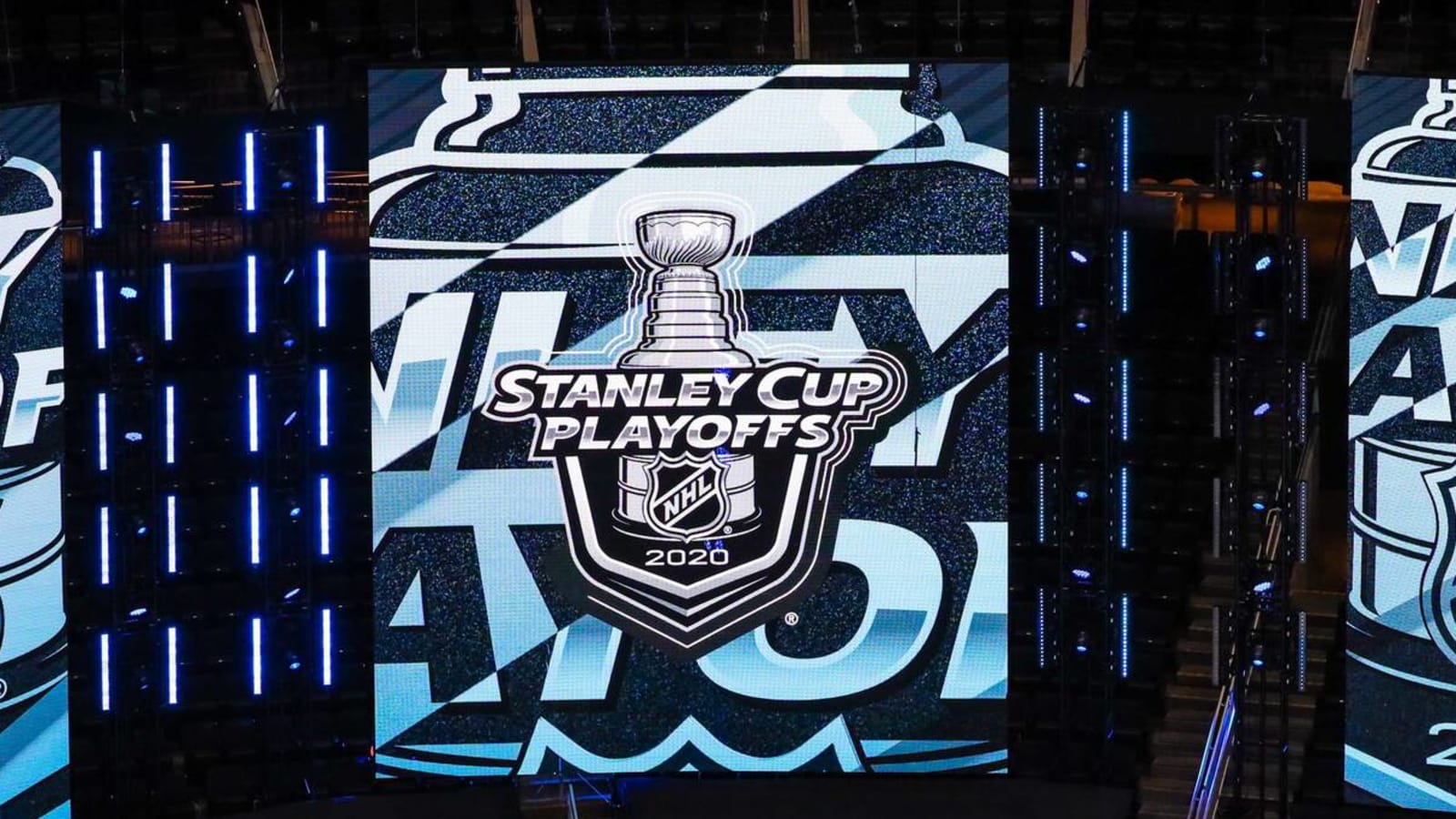
NHL redesigns Stanley Cup playoffs logo
The NHL unveiled a new logo design and microsite for the Stanley Cup playoffs, multiple sources reported on Monday morning. This marks the first time in 13 years the logo has gotten a makeover.
The NHL is unveiling a new logo for the Stanley Cup playoffs and Final. Here’s the story behind it: https://t.co/C6ZnL6AWkm pic.twitter.com/QSzDvPViXW
— Stephen Whyno (@SWhyno) March 7, 2022
"We felt it was time for a fresh and energetic change," said NHL vice president of creative services Paul Conway, via ESPN. "Some of that was coming out of COVID and, having two new broadcast partners [ESPN and TNT], the time was right for us to explore what a new, reimagined Stanley Cup can look like."
The new design features a more realistic image of Lord Stanley's mug, complete with etchings on the top bowl and hints of winning teams carved into the body of the trophy. Adding the etchings was reportedly commissioner Gary Bettman's idea.
"We had originally presented the Cup illustration to Gary during the approval process. He thought it looked great but he said, 'It's missing the etchings,'" Conway said. "It really brought it over the finish line. It's the only sports trophy with every winner etched on it. Why wouldn't you want to tell that story?"
The design also features two newly designed fonts that pay homage to the league's roots: Windsor Sans, which commemorates the Windsor Hotel in Montreal where the NHL was founded in 1917, and Victoria SC Serif, which is a nod to 1925 Cup winners, the Victoria Cougars.
Along with the new logo, the league also unveiled a website that is devoted to giving fans the extensive history of the Stanley Cup and showing a behind-the-scenes look at how the new logo was created.
The 2022 Stanley Cup playoffs start on May 2.
More must-reads:
- Which players have the most points in NHL postseason history?
- Flyers announce major changes to coaching staff after disappointing season
- The 'Most 30-goal seasons in NHL history' quiz
Breaking News
Customize Your Newsletter
 +
+
Get the latest news and rumors, customized to your favorite sports and teams. Emailed daily. Always free!
