-


Follow Us

x

Eric Hartline-USA TODAY Sports
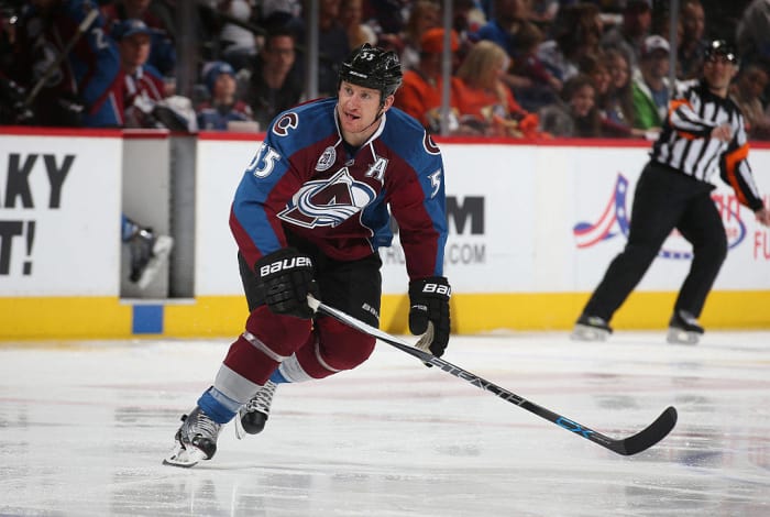
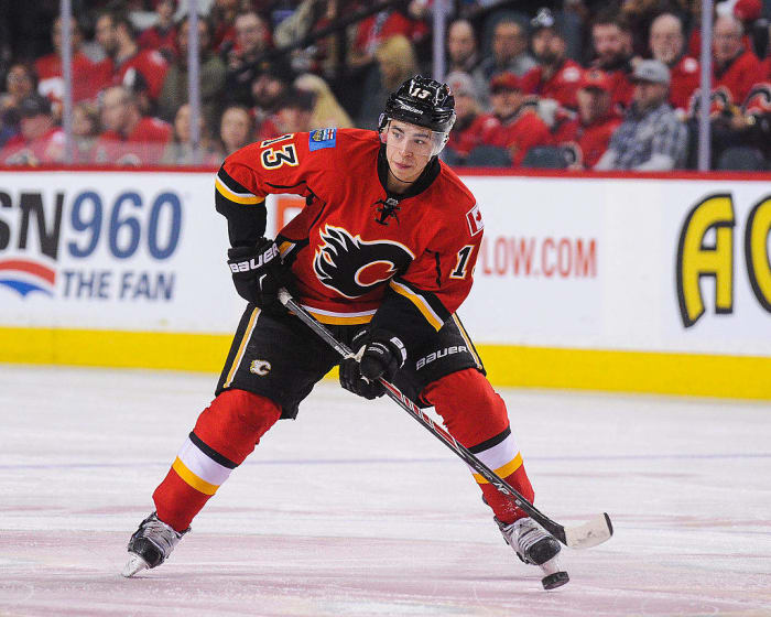
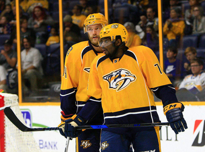
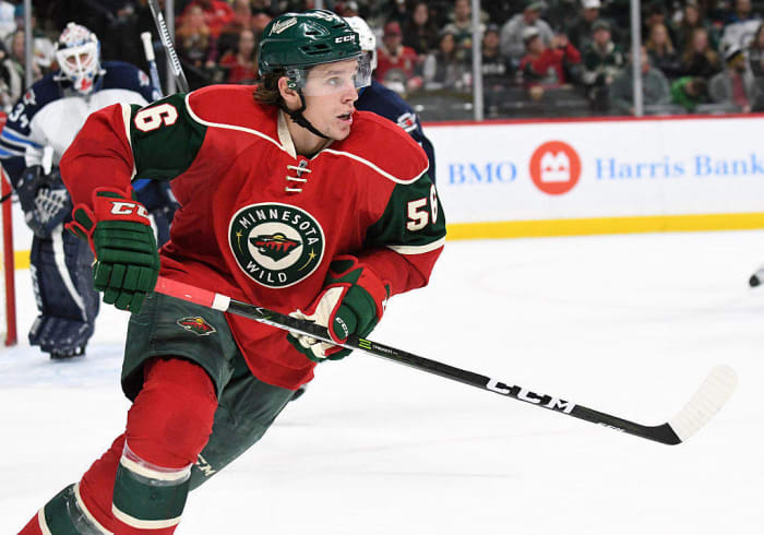
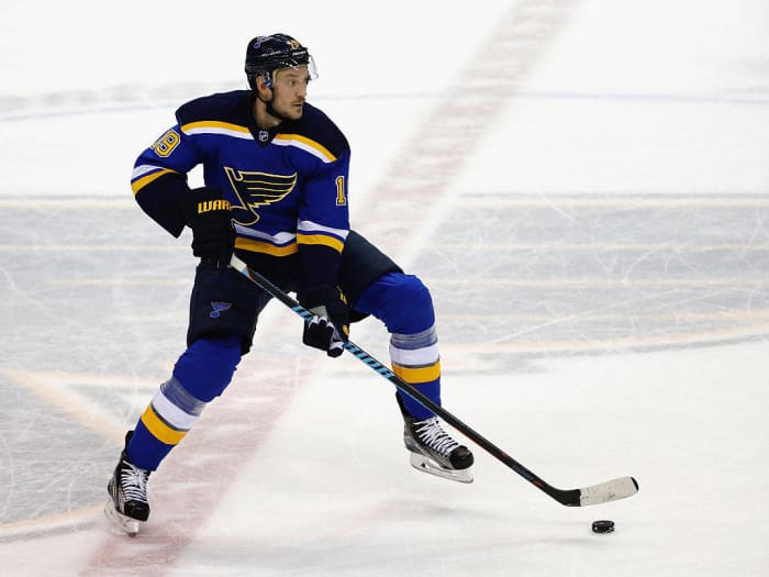
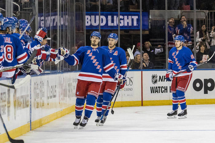
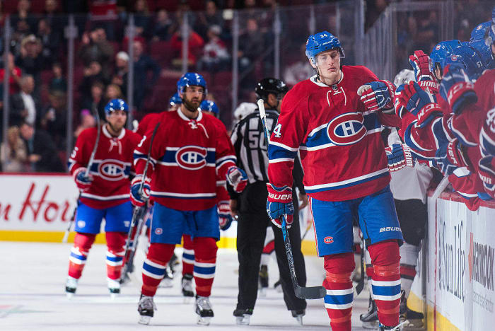
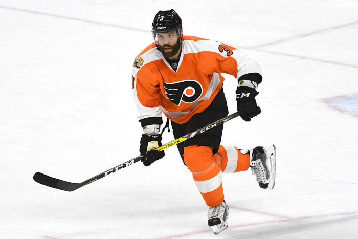
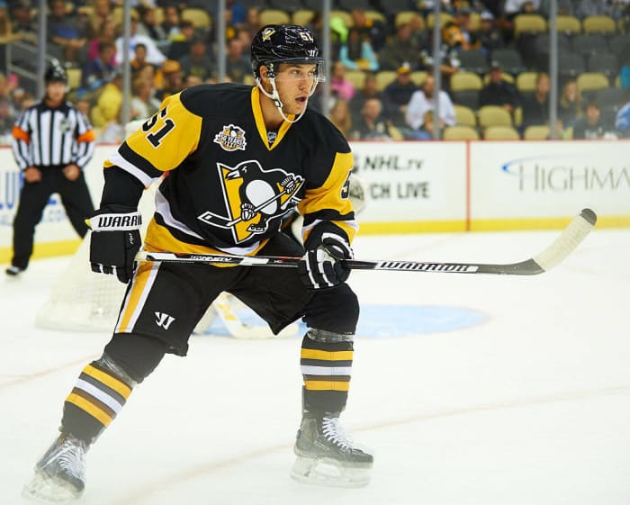
Ranking the uniforms of the NHL
Ranking the uniforms of the NHL based on color scheme, logo and the iconic nature of each team's jersey.


More must-reads:
- The 25 most unlikely Stanley Cup Final heroes
- All six teams have something to prove in Friday's Stanley Cup playoff action
- The 'Most 30-goal seasons in NHL history' quiz
Breaking News
Trending News


Customize Your Newsletter
 +
+
Get the latest news and rumors, customized to your favorite sports and teams. Emailed daily. Always free!

MY ACCOUNT SUBSCRIBE ADVERTISE JOBS FAQ
PRIVACY POLICY EDITORIAL POLICY CONTACT US
ABOUT YARDBARKER TERMS OF SERVICE


PRIVACY POLICY EDITORIAL POLICY CONTACT US
ABOUT YARDBARKER TERMS OF SERVICE
Copyright 2025 YB Media, LLC.
All rights reserved.
Use of this website (including any and all parts and
components) constitutes your acceptance of these
Terms of Service and Privacy Policy.
This site is for entertainment purposes only.
There is no gambling offered on this site.
Gambling Problem? Call 1-800-Gambler.

Use of this website (including any and all parts and
components) constitutes your acceptance of these
Terms of Service and Privacy Policy.
This site is for entertainment purposes only.
There is no gambling offered on this site.
Gambling Problem? Call 1-800-Gambler.